Apartment in Lisbon
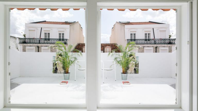
RGM 46 is an apartment renovation project located in Lisbon: with an area of roughly 60m2, it is a duplex apartment with a small terrace on the roof. The functional layout proposed included a living room, kitchen, bedroom and bathroom. The intervention began by creating a separation between the social and private areas of the apartment by way of the two existing floors.
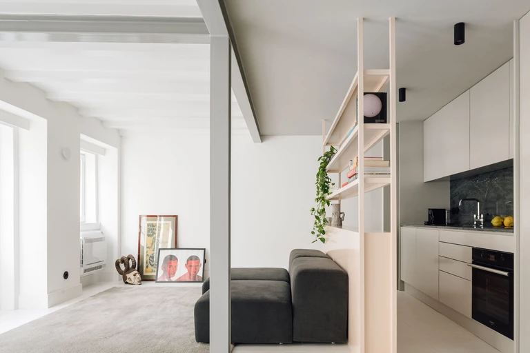
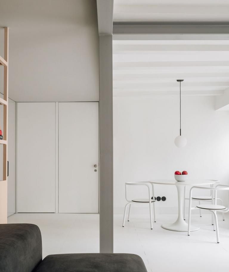
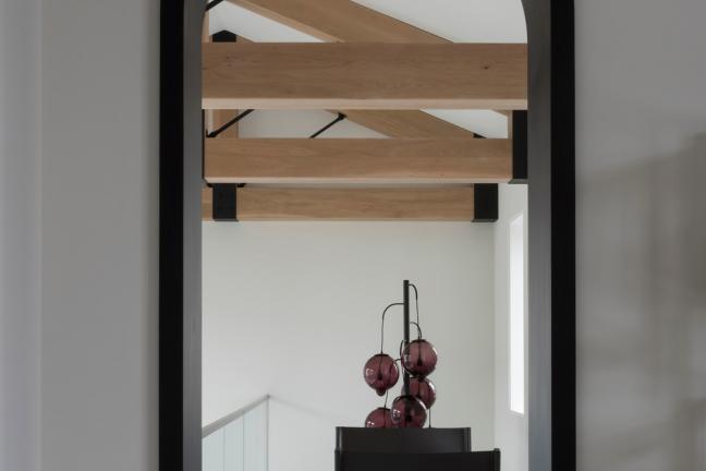
All the walls and obstacles on the lower floor were removed to create a single, expansive space for the living room. In order to do this, the structure of the apartment had to be reinforced with a new system composed of metal beams and pillars, which were left exposed and became a theme of the project. The strengthening structure marks out, lengthwise, two distinct areas of the living room, one facing south, which enjoys the outdoor balcony and the natural light from the openings in the main façade, and the other facing north, which communicates with the windowless rear wall. Together with the strategic position of the pillar, four separate areas are marked out: the living room to the south, divided into the west-facing living space and the east-facing dining area; and the functional area to the north.
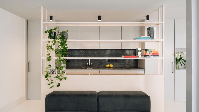
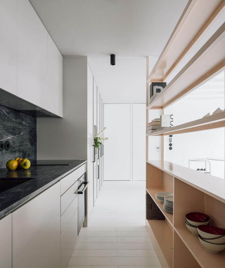
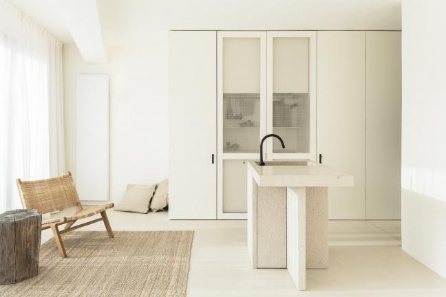
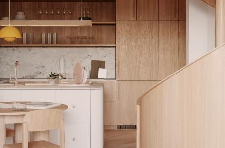
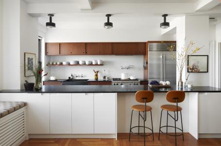
A new space was attached to the north-facing wall, comprising an abstract line of panels that includes the cupboards of the new kitchen, storage areas and access to the stairs leading to the upper floor. The addition of this new area aims, firstly, to introduce all the functions of the kitchen in one go and, secondly, to provide a single, continuous background for the space. The grey panels, together with the ceiling painted the same colour, use colour to make a spatial distinction from the bright living area, accentuated by the different shades of white on the surfaces and the momentum of the structural wooden joists that characterise the room’s ceiling. To soften the relationship between these two spaces, a semi-open metal shelving unit was created to support both the kitchen and living areas.
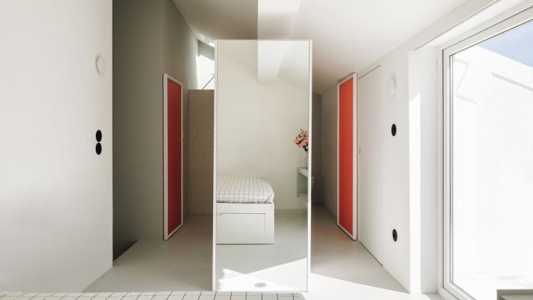
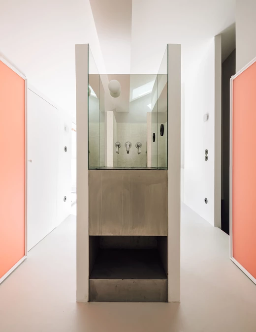
The upper floor contains an open-plan suite. It has a continuous floor and ceiling, although it is separated by strategically positioned pieces of furniture that create different hierarchies in the use of the space. Two freestanding pieces were created that separate, and allow movement between, the bedroom area and the bathroom area.
The bathroom is located on the east side, with natural light and ventilation coming from a new opening in the roof. This area can be closed using two pink acrylic panels to create a semi- transparent effect and filter coloured light into the space. The space separating the bedroom area includes a nook containing a metal washbasin and the inner surfaces are lined with mirrors.
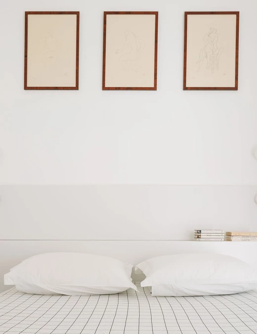
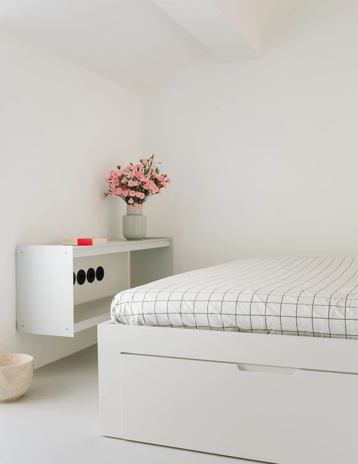
The main area of the bedroom explores scales of white and grey with different shades and textures. The bed is placed inside a nook with bedside tables at different heights. The outdoor terrace and landscape can be seen from here, reflected in the mirror on the wardrobe.
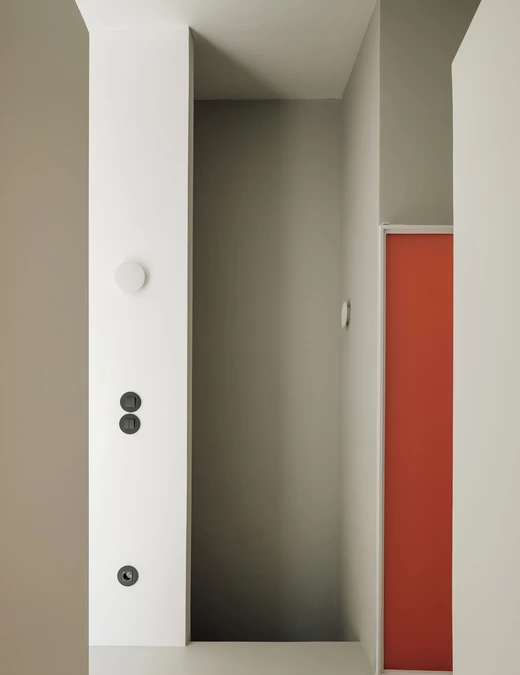
The electrical infrastructure and decorative lamps intentionally stand out in black, while the main wall lighting is invisible, white and unobtrusive.Overall, the project aims to lighten the space by creating broad areas that communicate with one another in a flowing movement, free from obstacles. The subtle variations between areas are meticulously materialised in the design and positioning of the furniture and the careful use of colour.

